

Don't forget tablets: designing for in-between screen sizes
· 6 min read
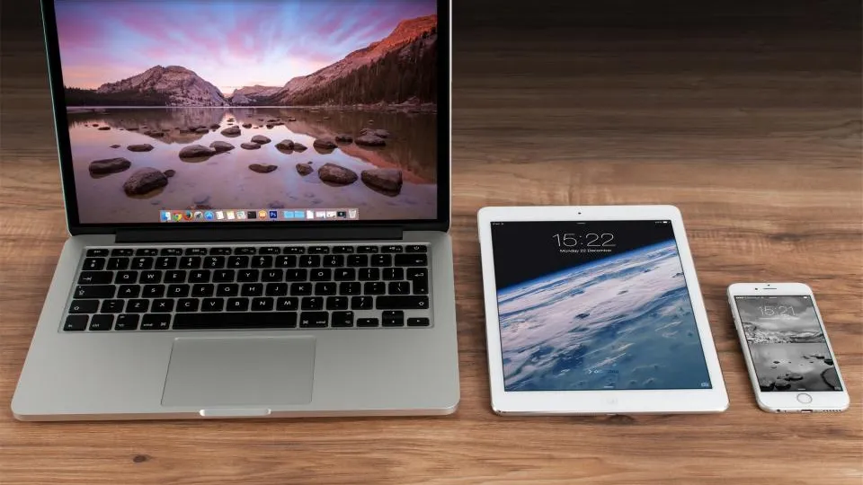
Designers usually mock up two screens: a phone and a desktop. Everything in between is left to chance. That middle band, roughly 768 to 1024 pixels wide, is where tablets live, and it is also where many layouts look stretched, squashed or oddly empty. Tablet responsive design means treating that band as a real audience with its own needs rather than an accident between two breakpoints.
This article explains why tablets get neglected, what makes them different, and the layout decisions that work well at those widths.
Why tablets fall through the cracks
The reasons are mostly practical. Tablets are a smaller share of traffic than phones for most websites, so they rarely get priority in a project plan. Designers often work on large monitors and test on their own phone, so nobody opens the site on an iPad until a client does.
There is also a technical trap. A layout with one breakpoint at, say, 768px shows the full desktop design on anything wider. A landscape tablet at 1024px or a portrait iPad Pro at 1024px therefore gets a layout planned for a 1440px monitor, just crammed into less space.
Who actually uses tablets
Your analytics will give the real picture, so check the device category report in GA4 before deciding how much effort to spend. Common tablet users include people browsing at home in the evening, staff using tablets at shop counters or reception desks, field sales teams showing catalogues to customers, and students or older users who prefer a larger screen than a phone.
What makes tablets different from phones and laptops
A tablet is not just a big phone or a small laptop. It combines features of both, which is exactly why neither layout fits cleanly.
- Touch on a larger canvas: there is room for desktop-style multi-column content, but fingers still need generous tap targets and there is no reliable hover.
- Two very different orientations: portrait is close to a large phone in feel, landscape is close to a small laptop. Users switch between them freely.
- Varied input: some people attach a keyboard and trackpad, so the same device may be used with a pointer one day and fingers the next.
- Viewing distance: tablets are often held further away than phones, so tiny text is still a problem even on a bigger screen.
Designing for portrait and landscape
Portrait, around 768 to 834px wide
In portrait, a single column of full-width content usually feels too wide and sparse, while three columns feel cramped. Two-column grids tend to work well for cards, products and team profiles. Long-form text should keep a comfortable line length, which may mean leaving margins on either side rather than running paragraphs edge to edge.
Landscape, around 1024 to 1194px wide
Landscape can often take a condensed version of the desktop layout: three columns of cards, a sidebar next to content, or a visible horizontal menu if it has only a handful of items. Watch the height, though. A landscape tablet is short, so a large hero banner plus a sticky header can leave only a sliver of visible content.
Handling the switch
When a user rotates the device, the page should reflow without losing their place, reopening a closed menu or resetting a half-filled form. Using CSS for layout changes, rather than JavaScript that runs once on load, keeps rotation smooth.
Layout choices that suit the 768–1024px band
A few decisions make a noticeable difference at tablet widths. Consider these when planning or reviewing a design:
- Add an intermediate breakpoint. Instead of jumping from a one-column phone layout to a full desktop layout, add a middle step where grids become two columns and spacing tightens a little.
- Set breakpoints by content, not device names. Resize the browser slowly and add a breakpoint wherever the layout starts to look wrong. Device sizes change every year; content needs stay stable.
- Choose the menu style deliberately. If your navigation has more than five or six items, a compact menu button often works better than a squeezed horizontal bar at portrait widths.
- Keep touch sizing. Do not shrink buttons back to desktop mouse sizes just because the screen is bigger. Aim for targets of at least 44 to 48 pixels.
- Use side margins for readable text. Cap the width of article text so lines do not run across the whole landscape screen.
- Size images for the slot. A hero image that looks sharp on a phone may look soft when stretched to tablet width, while the desktop file may be heavier than needed. Serve a size in between.
Content that benefits from the extra space
Tablets are good at a few jobs that phones handle poorly. Product comparison, image galleries, menus for restaurants, property listings and brochures all gain from a larger touch screen. If your business has these, it can be worth designing tablet views that show more at once, such as a gallery grid rather than a single swipeable image.
Admin dashboards and booking systems used by staff on tablets deserve special attention. Staff use them for hours, often standing up, so clear tap targets and uncluttered screens matter more than decoration.
Making tablets part of your next design review
At your next review, ask to see three mockups instead of two: phone, portrait tablet and desktop. Then open the live or staging site on an actual tablet in both orientations and try the main tasks. If a tablet is not available, a browser's responsive mode set to 768px and 1024px is a reasonable stand-in for layout checks.
When the middle band is planned from the start, it costs little extra. If you are commissioning a new site, mention tablet layouts in the brief; our website development team designs and tests across phone, tablet and desktop widths as standard.
Frequently asked questions
What screen width counts as a tablet?
There is no fixed rule, but most tablets report CSS widths between about 600 and 1366 pixels depending on model and orientation. Designing carefully for roughly 768 to 1024 pixels covers the most common range.
Should tablets see the mobile or desktop version of my website?
Ideally neither exactly. A responsive site can give tablets an in-between layout: more columns than a phone, but with touch-friendly sizing and simpler navigation than a full desktop view.
Is it worth designing for tablets if they are a small share of traffic?
Usually yes, because the cost is modest when planned early. Tablet users may also be valuable, for example staff using your system or customers browsing a catalogue at leisure.
Thinking about a website?
See what a package covers and what it costs, or ask us about your own project.