

How to plan a clean homepage layout that turns visitors into enquiries
· 7 min read
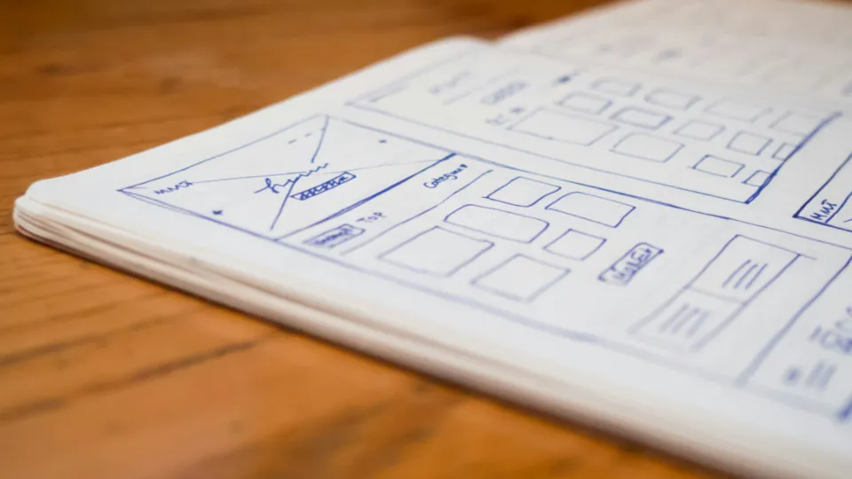
What is your homepage supposed to do? If the honest answer is “show everything we offer”, the page probably reads like a brochure that nobody finishes. A good homepage layout has a narrower purpose: help a stranger understand what you do, believe you can do it, and take one clear step towards contacting you. This guide plans that page section by section, in order, so each block earns its place.
You do not need design software to start. A sheet of paper, or a plain document with one heading per section, is enough to plan the structure before anyone opens a page builder.
Start with the visitor’s three questions
Someone arriving from a Google search or a WhatsApp link is silently asking three things. What is this business? Is it right for me? What should I do next? Every section of the homepage should answer one of those questions, and the order of sections should follow the order in which people ask them.
Write a single sentence answer to each question before planning the layout. For a dental clinic in Pune it might be: “Family dental clinic in Kothrud”, “Open evenings and Sundays, with transparent treatment prices”, and “Book a check-up on WhatsApp”. Those three sentences become the backbone of the page.
Block 1: the above-the-fold message
The first screen a visitor sees without scrolling carries the most weight. On a phone that is roughly the top 600 to 700 pixels, which is not much room. It needs four things and very little else:
- A plain headline saying what you do and for whom. “Accounting and GST filing for small traders in Surat” beats “Your Growth Partner”.
- A supporting line of one or two sentences with the main benefit or differentiator.
- One primary button for the action you most want, such as “Get a free quote” or “Chat on WhatsApp”.
- A relevant image of your real work, premises or product, sized so it does not push the headline off screen.
A secondary link like “See our services” is fine, but keep it visually quieter than the main button. If the first screen offers four equal choices, most people pick none.
Block 2: proof that you are real and capable
Directly after the opening message, visitors want reassurance. Place a compact proof strip here rather than burying it at the bottom. Good options include:
- A short line of genuine facts: years in business, number of projects completed, cities served.
- Logos of clients you have permission to show.
- Two or three real review snippets with the customer’s first name and town.
- Recognised certifications or registrations relevant to your trade.
Keep this block short. Its job is to lower doubt quickly so the visitor keeps scrolling, not to present your entire track record. Only use numbers you can back up; an inflated claim that a customer can disprove does more harm than no claim.
Block 3: services or products, grouped simply
Now the visitor is willing to look at what you offer. Show your main services as a small set of cards, usually three to six. Each card needs a short name in customer language, one sentence describing the outcome, and a link to the full service page.
How to decide what goes in the service cards
List everything you sell, then group it the way customers would think about it. A printing company might have dozens of products but only four groups that matter to buyers: business stationery, signage, packaging and event printing. Put the group that brings the most profitable enquiries first.
Resist the temptation to describe each service fully here. The homepage is a signpost. The detail belongs on the individual pages the cards link to.
Block 4: how working with you happens
Many enquiries stall because people do not know what happens after they get in touch. A simple three or four step outline removes that uncertainty. For example: share your requirement, receive a quote within one working day, approve and pay an advance, get delivery or completion.
This section is particularly helpful for services where buyers feel nervous about cost or commitment, such as renovation, legal help or software projects. Numbered steps in an ordered list or a simple row of short blocks work well.
Block 5: deeper trust for careful buyers
Some visitors scroll further because they are comparing options carefully. Give them richer evidence here: a short case example with the problem, what you did and the result, a few longer testimonials, or photos of completed work. If you have a portfolio or reviews page, link to it from this block.
A short FAQ can also sit here, covering the two or three objections you hear most often on calls, such as minimum order size, delivery areas or payment options like UPI and bank transfer.
Block 6: the closing call to action
By the bottom of the page, the visitor has either decided or left. Repeat the main action in a clear final section with a short heading, one sentence and the same primary button used at the top. Add the phone number and a WhatsApp link for people who prefer those channels.
If you use an enquiry form here, keep it to name, phone number and a short message. Every extra field reduces the number of people who complete it.
Putting the homepage layout order together
Here is the full plan in sequence, with the question each block answers:
- Opening message and main button: what is this and what can I do?
- Proof strip: is this business genuine?
- Service cards: do they offer what I need?
- Process steps: what happens if I get in touch?
- Detailed trust: have they done this well before?
- Final call to action: how do I start?
Header and footer sit around this structure, but the main content should follow this path. You can swap blocks 4 and 5 if your buyers care more about past results than process, but keep the opening message and closing action in their positions.
Test the plan before building it
Sketch the page on paper or in a simple wireframe, then show it to two or three people who match your customers. Give them ten seconds on the first screen and ask what the business does and what they would click. If they hesitate, the headline or button needs work.
After launch, use GA4 to watch how many visitors reach the enquiry form or tap the WhatsApp button, and compare that number month by month as you refine sections. If you would rather have the structure planned and built for you, our website development team works this way on every project, and you can browse finished examples in our portfolio.
Frequently asked questions
How long should a business homepage be?
Long enough to answer the visitor’s key questions and no longer. For most small businesses that means five to seven sections. Length matters less than whether each section has a clear purpose.
Should the contact form be on the homepage?
A short form or a clear button to the contact page both work. Many service businesses place a brief form in the final section and keep a WhatsApp or call button visible at the top.
Is a slider better than a single hero image?
A single, well-written hero section is usually easier to understand. Sliders split attention across several messages, and many visitors never see the later slides.
How often should I change my homepage layout?
Keep the structure stable and refine the content inside it. Review the page every few months using enquiry data, and change one section at a time so you can see what made a difference.
Thinking about a website?
See what a package covers and what it costs, or ask us about your own project.